Why LinkedIn Formatting Matters More Than Most People Think
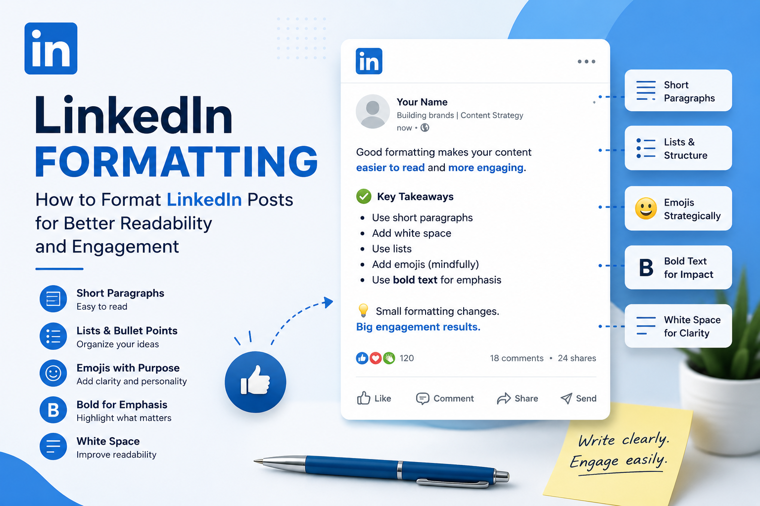
Learn how to format LinkedIn posts for maximum readability and engagement. Discover best practices, paragraph structure, emojis, bold text, formatting tools, and common mistakes to create posts people actually read.
InstaInker Team
InstaInker
Have you ever come across a LinkedIn post that looked genuinely interesting but you skipped it anyway?
Chances are, the problem wasn't the content but the formatting.
LinkedIn is a fast-moving platform. People scroll through dozens of posts every day, often on mobile devices. If your content looks difficult to read, most users won't even give it a chance.
That's why LinkedIn formatting matters.
Good formatting doesn't make a bad post go viral.
But it can make a good post significantly easier to consume.
And that often leads to more reads, more engagement, and better overall performance.
What Is LinkedIn Formatting?
LinkedIn content formatting means the way you format your content.
That includes:
- Paragraph length
- Line spacing
- Bullet points
- Emojis
- Headings
- Lists
- White space
It’s pretty straightforward:
Make it scannable and readable.
Before they even get to your message, they'll decide if your post is readable.
Example:
Poor Formatting vs Good Formatting
Poor Formatting
"I recently learned an important lesson while working with a startup founder. We spent weeks trying to solve a revenue problem before realizing the issue wasn't sales related. The issue was positioning. Once positioning became clearer, conversion rates improved significantly and customer acquisition became easier."
Nothing is technically wrong.
But it's difficult to read.
Good Formatting
“I recently learned an important lesson while working with a startup founder.
We spent weeks trying to solve a revenue problem.
At first, we thought it was a sales issue.
It wasn't.
The real problem was positioning.
Once the positioning became clearer, conversion rates improved significantly and customer acquisition became easier.”
Same insight.
Much easier to consume.
Why Good Formatting Improves Engagement
Good formatting helps in three ways:
1. It Enhances Readability
The information is processed quickly.
2. It Minimizes Friction
Large chunks of text do not make readers overwhelmed.
3. It Encourages More Reading
The easier the content feels, the more likely people are to continue reading. This becomes especially important on mobile devices, where most LinkedIn users consume content.
LinkedIn Formatting Best Practices
Use Short Paragraphs
Most successful LinkedIn creators avoid huge text blocks.
A good rule:
1–3 sentences per paragraph.
Example:
Instead of:
"We recently launched a new service and after several months of testing we discovered that most clients were struggling with the same challenge which led us to redesign the onboarding process."
Try:
"We recently launched a new service.
After several months of testing, we noticed something interesting.
Most clients were struggling with the exact same challenge.
That insight completely changed our onboarding process."
Use White Space
White space improves readability.
If your post looks crowded, readers often skip it.
Use Lists When Appropriate
Lists help organize information.
Example:
Instead of:
"Our strategy was geared towards content creation, SEO, social media, email marketing, and lead generation."
Use:
Our strategy was geared towards:
- Content creation
- SEO
- Social media
- Email marketing
- Lead generation
Emojis on LinkedIn? Should you use them?
It depends on who you're targeting.
If you are targeting creators and marketers: Emojis will help make your content more readable.
Example:
- Key takeaway
- Growth strategy
- Lesson learned
If you are a consultant, founder, CA, lawyer, executive:
Less is more.Pretending otherwise is unprofessional.
Too many emojis can make content feel unprofessional.
Poor Example
🚀🔥💯📈🔥🚀
Better Example
💡 One lesson I learned this year...
Moderation works best.
Can You Use Bold and Italic Text on LinkedIn?
One question that comes up frequently is whether LinkedIn allows users to format text using bold, italics, or different font styles.
Technically, LinkedIn doesn't provide built-in formatting options like Microsoft Word or Google Docs.
However, many creators use Unicode text generators to create:
Bold text
Italic text
𝘽𝙤𝙡𝙙 𝙄𝙩𝙖𝙡𝙞𝙘
These styles can help certain words stand out when used sparingly.
For example:
Instead of:
One lesson I learned from building a personal brand...
You could write:
One lesson I learned from building a personal brand...
This immediately draws attention to the opening statement.
Should You Use One-Line Sentences?
Many LinkedIn creators use:
One sentence.
Per line.
Like this.
Sometimes it works and sometimes it becomes excessive.
The purpose of short sentences is readability and not artificial engagement.
If every sentence becomes a separate paragraph, the content starts feeling forced.
A better way would be the balance between readability and natural writing.
LinkedIn Formatting Tools
There are several useful tools that can help professionals with LinkedIn formatting.
AuthoredUp
Pros:
- Specifically created for LinkedIn
- Good post preview
- Helps to format posts
Cons:
- Paid tool
Taplio
Pros:
- Generates content
- Allows scheduling
- Helps to format posts
Cons:
- Priced high for most users
Supergrow
Pros:
- Tools for creators
- Helps to draft posts
Cons:
- Specific for LinkedIn only
Notion
Pros:
- Great writing experience
Cons:
- Cannot preview LinkedIn format
Instainker
Pros:
- Generates LinkedIn content
- Repurposes content
- Allows scheduling
- Profile optimization
- Profile scoring
- Workflows specific to LinkedIn
- Allows formatting
Cons:
- Designed specifically for LinkedIn users.
Tools for Bold and Italic LinkedIn Formatting
Some commonly used tools include:
- YayText
- Lingojam
- Unicode Text Converter
- FancyTextGuru
- Instainker
Pros
- Makes important points stand out
- Improves visual hierarchy
- Can increase readability
Cons
- Overusing styled text makes posts look spammy
- Some fonts may not display correctly on all devices
- Accessibility can suffer if formatting becomes excessive
A good rule is simple:
Use bold formatting to emphasize key ideas, not entire paragraphs.
Common LinkedIn Formatting Mistakes
Writing Large Walls of Text
This is the most common mistake.
If your post feels overwhelming at first glance, people rarely read it.
Using Too Many Emojis
Emojis should support the content.
Not replace it.
Excessive Capitalization
Avoid:
THIS IS THE BIGGEST MISTAKE PEOPLE MAKE.
It often feels aggressive.
Overusing Line Breaks
Some creators leave huge gaps between every sentence.
This can make content feel unnatural.
Formatting Alone Won't Save a Bad Post
This is important.
Good formatting helps people consume content but it doesn't create value.
A poorly written idea won't perform just because it has perfect spacing.
Likewise, a brilliant idea hidden inside a giant wall of text often gets ignored.
You need both:
- Good content
- Good formatting
Instainker assists users to:
- Create LinkedIn Posts
- Increase Readability
- Improve Hooks
- Improve Content Structuring
- Repurpose Existing Content
- Post Consistently
These tools make sure professionals spend less time on the format of their posts and more time on what they actually need to say.
FAQ
Does LinkedIn formatting impact reach?
Indirectly, yes.Proper formatting increases readability which could increase engagement and reading time.
How long should LinkedIn paragraphs be?
1-3 sentences per paragraph.
Is it a good idea to include emojis in every LinkedIn post?
No.Include them only if it adds to the clarity of your writing.
What is the best LinkedIn formatting tool?
Depends on your requirements.AuthoredUp is great for formatting previews.Taplio is better for creators' tools.Instainker combines content creation, formatting assistance, profile optimization and scheduling in one tool.
Conclusion
LinkedIn Formatting is not about playing tricks on the algorithm.It is about respecting your reader.The more readable you make your content, the more engaged your audience will be.Even small formatting changes can make huge differences in your content performance.The difference between being ignored and being seen might be just a matter of formatting.
Related Articles
Start Creating Better LinkedIn Content
Use InstaInker to generate engaging posts tailored to your style.
Get Started Free